UI Mobile
UNIVERSITY OF IOWA
Led the vision, strategy, and design of a mobile app that significantly improved the student experience at the University of Iowa. The app drove increased engagement with university resources, streamlined communication channels, and enhanced the usability of academic systems.
The Challenge:
Information Overload
Navigating the University of Iowa’s vast resources and services was a major pain point for students. They faced an overwhelming amount of information, an abundance of irrelevant communication, and a fragmented access to academic tools across the university's multiple systems. These challenges created frustration and decreased engagement.
Our Approach:
Personalize the Student Experience
Tasked with leading the UI Mobile initiative, I implemented a clear strategy to address the core challenges faced by students. Through comprehensive research, including surveys, focus groups, and system evaluations, I crafted a targeted product vision and strategy focused on the following key objectives:
-
Personalize the app to meet the unique needs of each student.
-
Make university services and resources more accessible and engaging.
-
Standardize the interface and simplify access to academic systems.
-
Reduce the noise in student communications by focusing on relevance and timing.
Key App Features
Increase Awareness and Engagement
Resource Profiles


Standardized pages for university groups to manage and promote their services, updates, and events.
Campus Maps
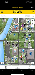

Interactive maps and wayfinding features to help users navigate campus and discover university resources.
Resource Discovery

Pages that highlight resources, news, and events, helping users organically become aware of and discover new opportunities to satisfy their needs.
Enhance Usability
User Dashboard


A personalized dashboard displaying important information from multiple systems in one place.
User Calendar


An all-in-one calendar combining academic schedules, important academic dates, and university breaks and holidays.
Reduce Communication Overload
Dashboard Banners

Sticky, personalized banners that ensure critical information is seen and acted upon.
Opt-in Messaging
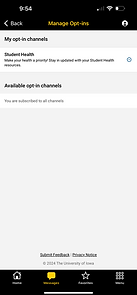

Customized communication channels that allow students to choose what information they receive.
My Role:
Product Vision, Design, and Successful Launch
As the Product Manager, I was responsible for the successful rollout of a new mobile app within an eight-month timeframe using a vended platform from Modo Labs, Inc. My role encompassed product vision and strategy, UX/UI design, content management, and collaboration with development for external software integration.
Collaborate Across Campus
-
Worked with cross-departmental groups to gain insights into student and staff challenges.
-
Partnered with resource teams to identify relevant content for target users, mapped out engagement paths, and designed mobile app screens to represent each resource effectively.
Cohesive UI/UX Design and Implementation
-
Developed standardized UI components aligned with university brand standards to ensure a seamless user experience.
-
Configured and implemented designs in Modo Labs, working closely with the development team to integrate custom solutions.
Strategic Presentation and Launch Execution
-
Presented the mobile app vision, strategy, and design to campus groups, from students to executives, securing support and alignment.
-
Collaborated in the creation and execution of a go-live strategy that effectively promoted the app's launch to students, faculty, and staff.
Impact and Results
While the app is still in it's infancy, my focus on user-centered design, campus-wide collaboration, and strategic alignment with the university’s goals has set the stage for measurable outcomes in the near future. We're tracking the following results:
Early User Adoption
-
We implemented a targeted go-live plan to drive app downloads and usage, ensuring that students quickly saw value in the app’s design and content.
-
69% of the targeted user group, new students, used the app in the first 2 weeks of the semester.
-
Users averaged 12 sessions a week during the first 2 weeks of the semester.
User Feedback Loops
-
Integrated continuous feedback channels, including in-app surveys and focus groups, to monitor user experience and identify opportunities for immediate improvement.
Resource Engagement
-
Crafted pathways for students to quickly find and engage with a resource, connecting a student need to a university support service. Tracking engagement pathway usage through the app and comparing it to alternative pathways.
Testimonial
“I think that app is great. I could really see myself using this on a daily basis for simple things like checking menus and times for dining halls and it’s made to work very intuitively. A small thing that the app does, but is super convenient for new students is being able to see your classes with times and location. I wish I had this my first semester just because it is so convenient.”
- Student from University College